Content may be king, but publishing content without structuring it is simply wasted effort. By strategically incorporating links, marketers can encourage click-throughs, improve page quality scores and keep visitors engaged.
While links may be placed almost anywhere within a web page, being strategic about their placement can make a big difference. Main navigation aside, these 4 locations provide a wonderful opportunity to make your web pages work smarter for you:
Compare the following:
A: "Click here to learn 4 strategies for link placement within a paragraph to improve reader engagement."
B: "Click here to learn 4 strategies for link placement within a paragraph to improve reader engagement."
While it's certainly an obvious prompt to action, the linked phrase "Click here" in A encloses inert anchor text with no real relevance to the link's destination. Plus, "Click here" feels a lot like "Buy Now", which for an inquisitive reader is much too early in their discovery process.
In contrast, the phrase "4 strategies for link placement" encloses a powerful statement and describes the link destination.

By linking in this manner, marketers are able to create a visual clue that not only emphasizes a point, and sets search-friendly anchor text, but also provides an obvious prompt for the reader that they'll find more information on the topic by clicking.
It also makes things perfectly clear to search engines what the topic / content on the linked page is, enhancing the link value ("juice") it passes to that linked page.
Key Takeaways: Prompts placed naturally within text content keep visitors on-site, discovering additional material. Relevant anchor text influences search engines positively.
Deeper discovery helps build trust in you as the information provider (and over time, as a thought leader). Multiple page views in a session send a positive signal to search engines and provide clues to visitor intent.
Additionally, Google is assumed to consider text around a link when evaluating relevance. Many SEOs believe this to include as much as 200 words.
Pretty well every website you visit will have a main navigation bar at the top of the page. You know, the type of navigation where you need to go back up to the top of the page to click a tab or link to go to another page. That's not a great user experience.

On well optimized lead capture websites like the ones we create at Kayak, you'll find a minimal main navigation, along with inside-page side menus displaying a collection of topically related links.
For example, a page talking about furniture refurbishing may include a short list of related accessories, such as paints, paint brushes, or even tutorials, linked in the side-bar.
When you present links to related information, you create a cluster of related information, which is in tune with how people think, and the way search engines look to connect information.
Graphical CTAs provide an opportunity to communicate that there's something substantially 'More' on a linked page, such as a white-paper, ebook or other download, or a subscription opportunity.
Visitors clicking a CTA are typically deep within the Consideration stage of their buyer journey seeking deeper or detailed information on the topic.

Generally speaking, visitors clicking to an offer are more likely to provide contact info (email, name, etc), as you've earned their trust through a good user experience and great information.
We all know what happens when we flip a light switch. It turns on or off. You've seen a lot of "Buy Now", "Request a Quote", "Free Trial", and "Contact Us" type buttons on many websites - to know what they do.

Visitors clicking these types of links are ready to make contact, placing them in the Action stage of their buyer journey.
Bonus Tip: Don't use "Submit" on any form, call-to-action or other website button.
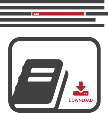
Consider for a moment that a hyperlink and a graphical CTA may reside in close proximity to one another on a web page.

A visitor who is ready to engage is more likely to click the CTA. Whereas, a reader clicking the hyperlink is likely still in research mode, not yet ready to take action.
If you are tracking visitor activity (you should be), you'll be able to see which link is selected, presenting an opportunity to decipher your visitor's intent.
I recommend ending each page/article with both link options. Like what you hear? Let us know in the comments or in social.