Generating a bunch of traffic to your site is great, but does little if your site isn't helpful for your visitors. Depending on the industry, most websites have a 30-60% bounce rate on average.
This means a significant portion of web traffic entering your website leaves without navigating to any other pages. And many times they may never come back. Yikes! Here are some tips you need to consider to improve user experience and decrease your bounce rate.
 Your website represents who you are and what you offer. When people see it for the first time they’re thinking:
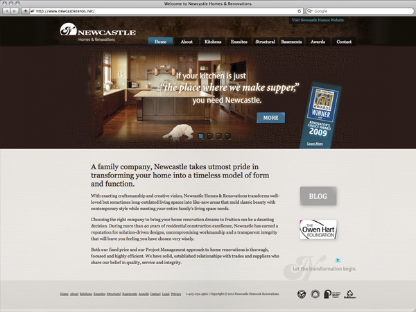
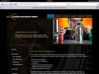
You need to ask yourself all of these questions when evaluating your website. While design is not the most important factor in creating a successful website and often times folks put too much emphasis on how a site looks instead of it works, appearance is the first impression you give to any visitor. If that first impression isn't a good one, you may have lost an opportunity to gain another customer.
Tips for a great website design:
Perhaps one of the biggest factors to keep visitors on your website is having a good, solid navigation system that supports all search preferences. If people can’t find what they are looking for, they will give up and leave. Important factors in a site’s navigation include:
 of your page).
If you like what you see, contact us today so we can get started revamping your online business.
Inspiration: 25 Website ‘Must Haves’ For Driving Traffic, Leads & Sales, HubSpot